Sans Forgetica: A Font Designed to Improve Memory, Tested Four Times, Found Not To
A font built to make reading harder so you remember more. Four independent labs tested it and found no memory benefit, while self-testing worked in the same students.
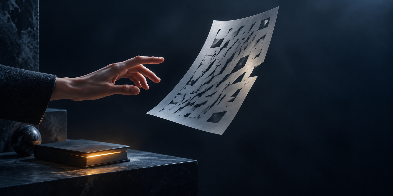
In October 2018, RMIT University in Melbourne released a free font called Sans Forgetica. It was back-slanted, with gaps punched out of every letter, and it was deliberately awkward to read. The claim was that the awkwardness made you remember what you read in it.
It was downloaded widely, shipped as a Chrome extension, and covered everywhere.
Then four independent research groups tested it, and it did not work. One of them found it made memory slightly worse. Meanwhile the broader idea it was built on, that making text harder to process improves learning, had already been meta-analysed and found to be null.
This is a good story, and a useful one, because the reasoning behind the font was not stupid. It was a legitimate hypothesis that turned out to be wrong, which is different from a scam.
The idea it was built on
The underlying theory is desirable difficulty: that some obstacles during learning force deeper processing and produce better retention. It is a real and well-supported principle in other forms: spacing your study sessions and testing yourself rather than rereading both work, and work robustly.
The specific claim that perceptual difficulty counts as a desirable difficulty came from Diemand-Yauman, Oppenheimer and Vaughan in 2011, published in Cognition.
Their first study gave 28 participants information about fictional alien species to learn in 90 seconds, in either a clean 16-point Arial or a degraded font: 12-point Comic Sans or Bodoni at 75% grey. After a 15-minute delay:
- Fluent font: 72.8% correct
- Disfluent font: 86.5% correct
- t(26) = 2.3, p < .05
The second study took it into real classrooms: 222 Ohio high-school students across six courses, with their actual materials reformatted into harder-to-read fonts. Students in the disfluent condition scored higher: M = .164 versus M = −.295 on standardised course measures, t(220) = 3.38, p < .001.
Two studies, one lab and one classroom, both positive. That is a reasonable basis for building a font.
What RMIT built
Sans Forgetica was made at RMIT by Stephen Banham, a lecturer in typography, working with Dr Jo Peryman and Dr Janneke Blijlevens of the university's Behavioural Business Lab. It was released on 3 October 2018.
The stated evidence was lab and online testing with around 400 Australian university students, and the design rationale was that the font sat at a "sweet spot": enough obstruction to trigger deeper processing, not so much that reading broke down.
That work was not published in a peer-reviewed journal. The claim entered the world through a media release.
Four labs tested it
Taylor, Sanson, Burnell, Wade and Garry (2020), in Memory, ran four experiments with 882 participants in total, explicitly to replicate the creators' unpublished findings. Participants rated Sans Forgetica as harder to read than Arial, so the manipulation worked. But it produced equivalent memory performance, and in the second experiment participants recalled fewer Sans Forgetica word pairs than Arial ones. The authors' summary was that the font "promotes a feeling of disfluency, but does not boost memory."
Wetzler, Pyke and Werner (2021), in SAGE Open, tested 120 undergraduates (58 in Sans Forgetica, 62 in Times New Roman) crossed with restudy versus self-testing, with an unexpected test a week later.
| Condition | Mean recall | Statistic |
|---|---|---|
| Sans Forgetica | 39.8% (SD 18.2) | F(1, 118) = 0.02, p = .883, partial η2 < .01 |
| Times New Roman | 40.2% (SD 16.0) |
Four-tenths of a percentage point apart. The crucial detail is what else was in the same dataset: the testing effect was clearly present, F = 14.01, p < .001. The experiment was sensitive enough to detect a real memory effect. It just did not detect one from the font.
Huff, Maxwell and Mitchell (2022), in Cognitive Research: Principles and Implications, ran four experiments with roughly 300 participants using the DRM false-memory paradigm. Correct recall was .53 for Arial against .54 for Sans Forgetica in one experiment, and .59 against .56 in another. False recall was, if anything, slightly higher in Sans Forgetica (.27 vs .32; .27 vs .31). They reported Bayesian evidence in favour of the null.
Geller, Davis and Peterson (2020) published a fourth null in Memory, titled "Sans Forgetica is not desirable for learning." We are not printing figures from it because we could not retrieve the full text to verify them; the citation is below.
Four groups, four nulls, one of them slightly negative.
The bigger problem: the whole idea is null
Even before Sans Forgetica existed, the general disfluency effect had been meta-analysed. Xie, Zhou and Liu (2018) pooled 25 articles, N = 3,135:
| Outcome | Effect (d) |
|---|---|
| Recall | −0.01 |
| Transfer | 0.03 |
| Judgments of learning | −0.43 |
| Time spent studying | 0.52 |
That final pair is the interesting result. Disfluent text made people less confident they were learning and made them spend longer on the material; the manipulation clearly did something. It just did not change what they actually learned.
Then this meta-analysis was itself challenged. Weissgerber, Brunmair and Rummer (2021) audited it and found genuine coding errors, including a study miscoded as supporting disfluency when it had shown a small advantage for fluent text. This is exactly the kind of critique that should overturn a result.
It did not. Correcting the errors moved the transfer effect from +0.026 to −0.008, a change of 0.034. The critics concluded that Xie and colleagues' transfer results "appear robust." A hostile audit of the null found the null.
Being fair to RMIT
Two things should be said plainly.
RMIT has not retracted anything. There is no withdrawal statement and no correction. What is true is that the font's dedicated website no longer resolves and the university no longer actively promotes it. We are not going to describe that as a retraction, because it is not one.
The hypothesis was reasonable when made. In 2018 the published evidence was two positive studies in a good journal. The meta-analysis had only just appeared. A typographer and two behavioural scientists building a font on that basis were making a defensible bet. The bet lost, in public, which is the ordinary way science works and a better outcome than a bet that never gets tested.
What to do instead
The useful part of this story is not that a font failed. It is that the failure came with a control condition that succeeded.
Wetzler and colleagues found nothing from the font and a large effect from self-testing in the same students, in the same week, on the same material. Xie's meta-analysis found nothing from disfluency but confirmed that people spent 0.52 standard deviations longer studying it: effort that produced no return.
That is the shape of the lesson. Desirable difficulty is real, but the difficulty has to be in the retrieval, not in the perception. Making a page harder to look at costs you time and confidence and buys you nothing. Making yourself recall the material without looking at it works, and has worked in every test anyone has run.
If a study technique makes learning feel harder, that is not by itself evidence it is working. Sans Forgetica felt harder to read in every experiment that measured the feeling, and that feeling was, in the end, the only thing it reliably produced.
The gap between what feels effortful and what actually works runs through most of this subject, see the cognitive offloading guide for the wider picture, study tools and apps actually worth it for the same test applied elsewhere, and screen reading versus paper for another surface effect that turned out smaller than advertised.

Human Operating System
Human Operating System is a research-led publication about the human mind under digital pressure. We report what the evidence does - and does not - support.
About Human Operating SystemSources & Further Reading
8 sourcesThese are the sources used for this article. Where a study's limits matter to the claim, those limits are kept in the citation.
View all 8 sourcesHide sources
- Diemand-Yauman, C., Oppenheimer, D. M., & Vaughan, E. B. (2011). Fortune favors the bold (and the italicized): Effects of disfluency on educational outcomes. Cognition, 118(1), 111-115. Open source ↗
- Xie, H., Zhou, Z., & Liu, Q. (2018). Null effects of perceptual disfluency on learning outcomes in a text-based educational context: A meta-analysis. Educational Psychology Review, 30, 745-771. Open source ↗
- Weissgerber, S. C., Brunmair, M., & Rummer, R. (2021). Null and void? Errors in meta-analysis on perceptual disfluency and recommendations to improve meta-analytical reproducibility. Educational Psychology Review, 33, 1221-1247. Open source ↗
- Taylor, A., Sanson, M., Burnell, R., Wade, K. A., & Garry, M. (2020). Disfluent difficulties are not desirable difficulties: The (lack of) effect of Sans Forgetica on memory. Memory, 28(7), 850-857. Open source ↗
- Geller, J., Davis, S. D., & Peterson, D. J. (2020). Sans Forgetica is not desirable for learning. Memory, 28(8), 957-967. Open source ↗
- Huff, M. J., Maxwell, N. P., & Mitchell, A. (2022). Distinctive Sans Forgetica font does not benefit memory accuracy in the DRM paradigm. Cognitive Research: Principles and Implications, 7, 39. Open source ↗
- Wetzler, E. L., Pyke, A. A., & Werner, A. (2021). Sans Forgetica is not the “font” of knowledge: Disfluent fonts are not always desirable difficulties. SAGE Open, 11(4). Open source ↗
- RMIT University (2018). Sans Forgetica: New typeface designed to help students study [media release, 3 October 2018]. Open source ↗
The Weekly System
Join the launch list for one calm, research-led email about attention, memory, learning and the systems designed to hold your attention. No noise, no panic and no unsupported certainty.